Ranking MLS' new-for-2020 shirts, from Sporting KC's polka dots to Chicago's standalone look

Major League Soccer celebrates its 25th anniversary with the kickoff of the 2020 season. The fun begins on Feb. 29 with Opening Weekend, and the first broadcasts to air on ESPN take place on March 1, when the reigning MLS Cup champion Seattle Sounders host the new-look Chicago Fire (3 p.m. ET, LIVE on ESPN) and David Beckham's Inter Miami play their first competitive match in a glamour tie at LAFC (5:30 p.m. ET, LIVE on ESPN).
Of course, with any new season comes a raft of new kits. With all 26 clubs introducing new kits to celebrate the league's 25th season in existence, ESPN ranked the new threads from top to bottom.
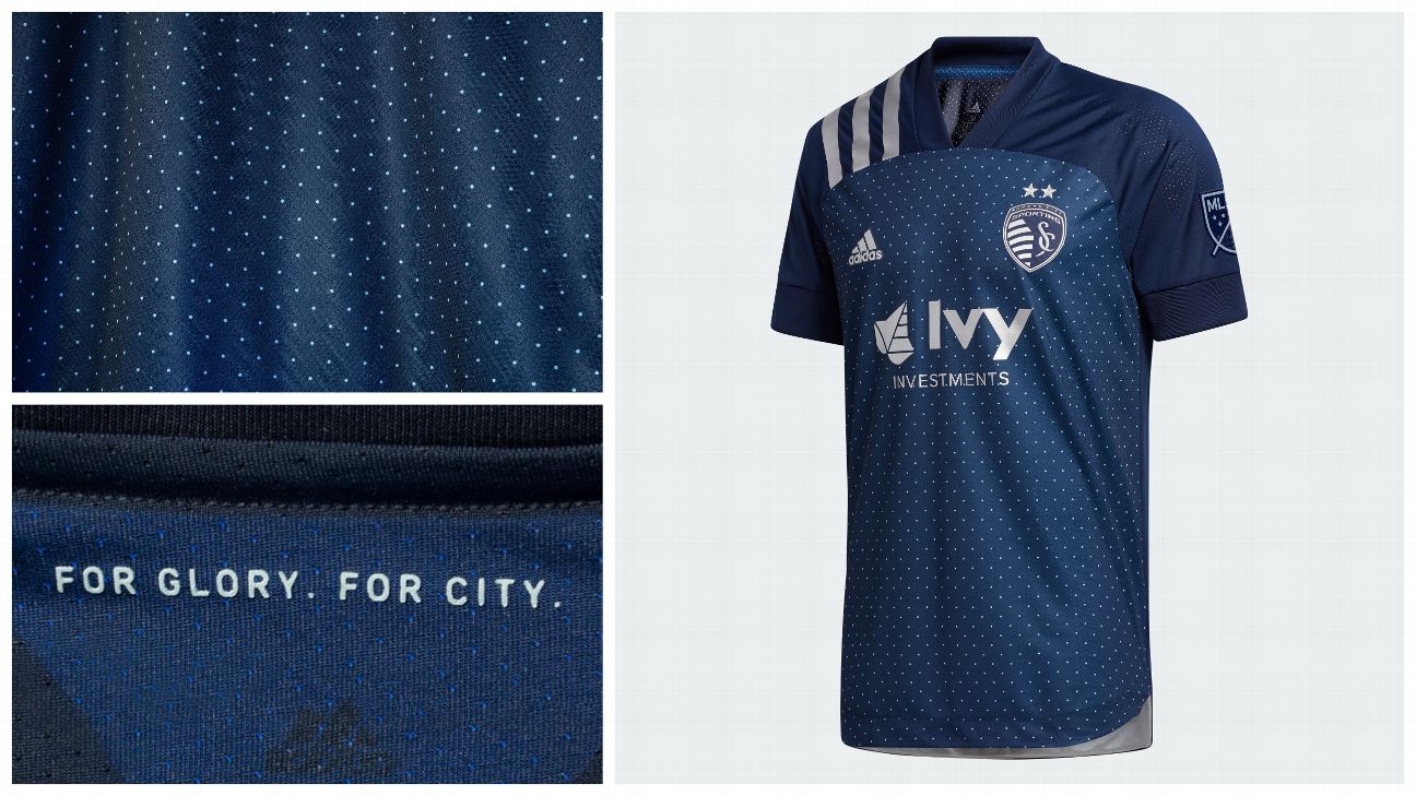
1.Sporting Kansas City
What we like: The polka dots. Sporting says they're inspired by metallic fins that adorn the exterior of Children's Mercy Park, which makes for a genuine connection to the club's roots, while also giving the shirt a distinct and clean look.
What we don't: This will be a recurring theme, but it's a shame the template Adidas has used for this year's shirts necessitates solid-colored shoulders; these would've looked killer with the polka dots all over.
The verdict: There are a number of wild kits in 2020, and Sporting has found the elusive balance between boldness and restraint.
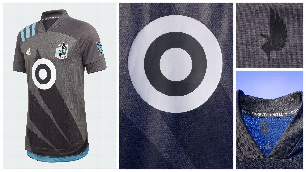
2.Minnesota United
What we like: The club finally gave the fans the loon wing they've been asking for since its first year in MLS, and the hand-drawn component is a fun touch. The blue of the shoulder stripes really pops against the club's traditional home gray.
What we don't: The way the sponsor logo lays over the wing, with a gray fill behind the logo obscuring the shape of the hand-drawn graphic.
The verdict: It's sure to be a fan favorite, which is all any club can ask for.
3.D.C. United
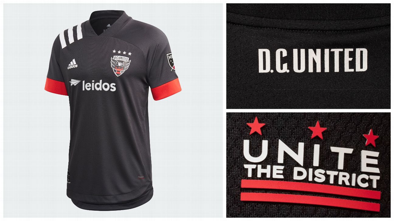
What we like: It's not necessarily a throwback, but D.C.'s new shirt is awfully reminiscent of the club's inaugural outfit: all black, with red and white accents and no frills to speak of. It's a return to the club's roots, a reestablishment of its identity.
What we don't: It's picking nits, but the "Unite the District" jock tag uses a different font from what's in the club crest and the back of the neck.
The verdict: MLS doesn't have the same history as other leagues, entering just its 25th season. It's good to see clubs use what heritage they have.
4. Vancouver Whitecaps
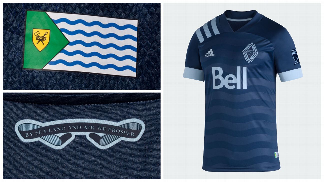
What we like: The embossed wave pattern in the jersey, which is a nod both to the city's flag as well as the Burrard Inlet, which the city rests against.
What we don't: The monochromatic crest. The stripes over the shoulder are white -- why can't the crest include some, too?
The verdict: The Whitecaps are routinely one of the best-looking teams in MLS, and this shirt does nothing to change that.
5.Orlando City
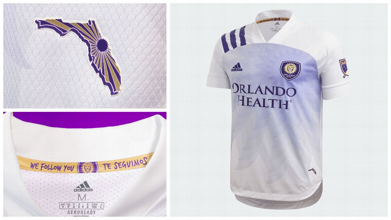
What we like: The purple sun radiating from the crest looks gorgeous, and the state of Florida jock tag might just be the best in MLS.
What we don't: The abrupt change from the sun's purple rays to the bright white of the shoulders.
The verdict: Possessing one of the most distinctive palettes in MLS, Orlando finally has a shirt to match its regal colors.
6.FC Dallas
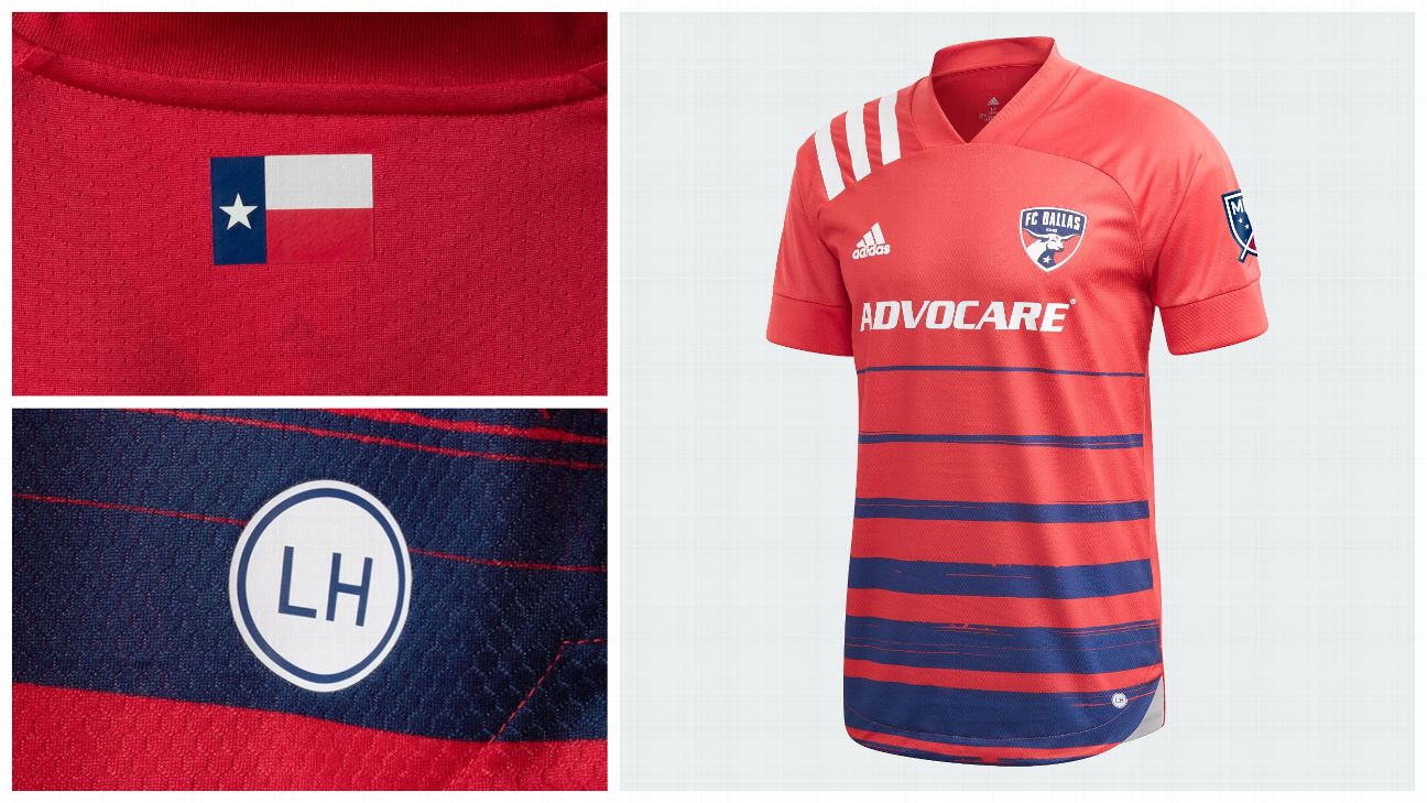
What we like: The return of the hoops! The differing widths of these bands and the fact that there's no white make for an original take on Dallas' traditional design.
What we don't: How many of those unique hoops could be hidden players who insist on tucking their shirts into their shorts? That'd be a real shame.
The verdict: The best kit Dallas has had in, well, probably ever.
7. LAFC
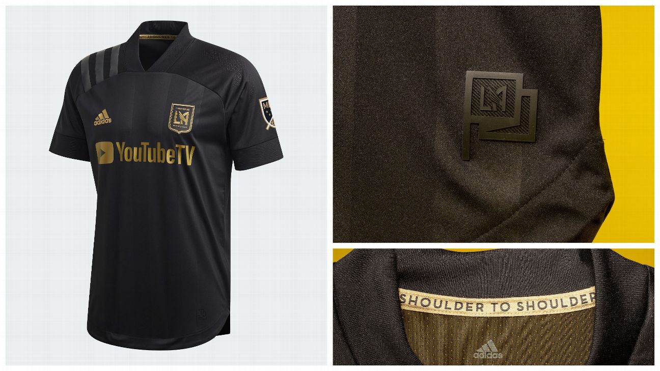
What we like: The ghost-like embossed black stripes are very sharp. Without them, the shirt would fall flat.
What we don't: The black-on-black shoulder stripes are understated, which lends the shirt further class, but a club becoming known as the gold standard in MLS should have as much gold on its shirts as possible.
The verdict: It's clean, it's simple, it's classic.
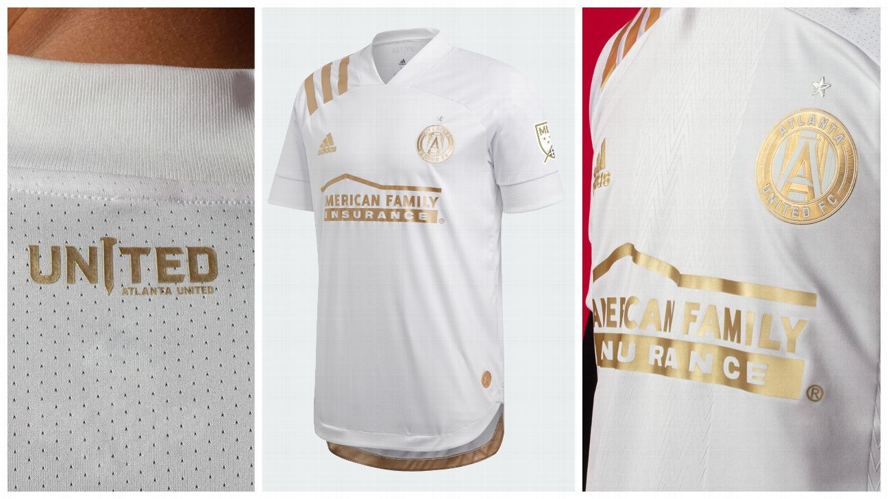
8.Atlanta United
What we like: The embossed herringbone pattern is probably the best subtle touch of this year's class of shirts, and Atlanta says the kit is filled with "drip drop swagger and all gold everything," which -- as pointed out in the LAFC entry -- is good.
What we don't: This kit was designed by the same person at Adidas responsible for this year's Real Madrid home kit, and it shows.
The verdict: Atlanta continues its tradition of away kits more aesthetically pleasing than its home colors, following 2018's King Peach.
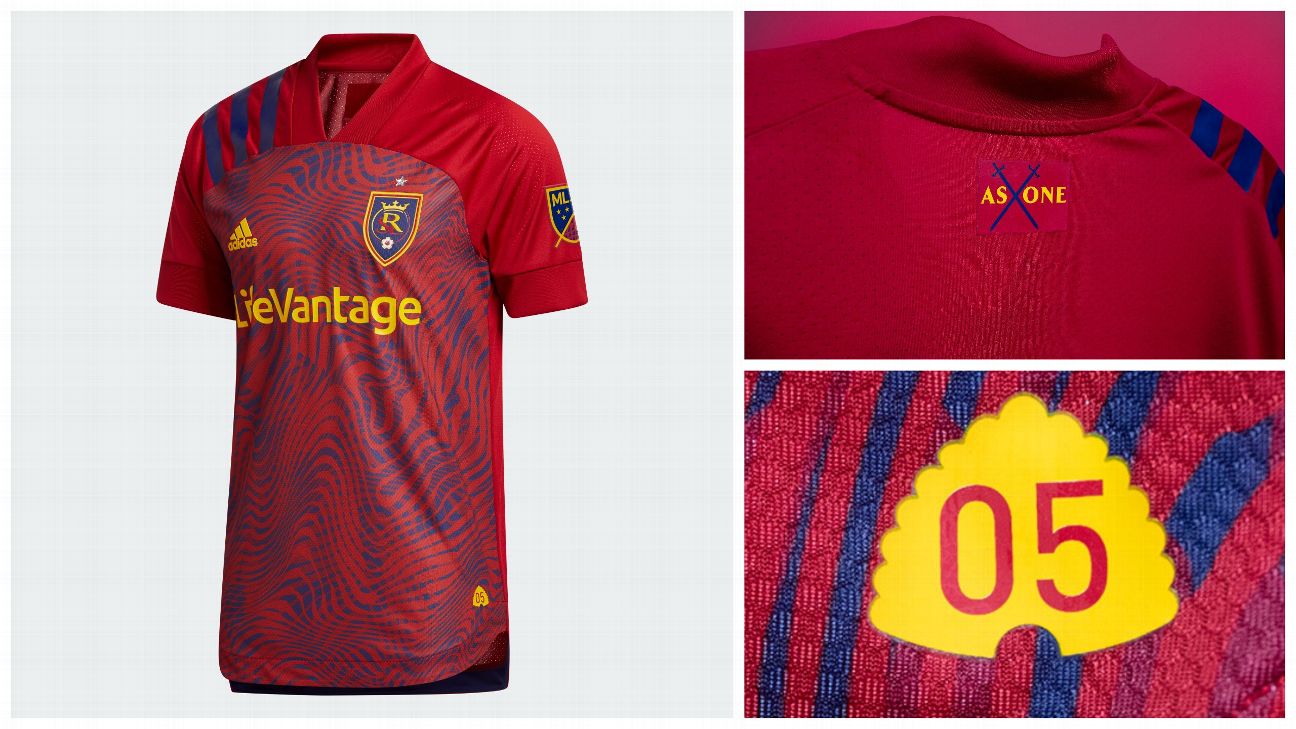
9.Real Salt Lake
What we like: That there's a story in this bold graphic pattern, which is an abstract take on a topographic map, paying tribute to the mountainous terrain of Utah.
What we don't: Apologies for continuing to beat this dead horse, but would like to see the bold pattern continue up the shoulders and sleeves.
The verdict: Adidas' best work yet with RSL's primary colors.
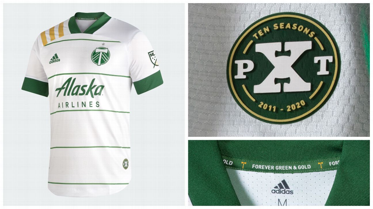
10.Portland Timbers
What we like: The wood grain inside the hoops! My goodness, the wood grain! What a touch.
What we don't: That unless you're three feet away, you'd never know the wood grain was there. Also, the gold stripes over the shoulders are a little aggressive for an otherwise stately shirt.
The verdict: Excellent details, but this shirt is simultaneously staid and overaggressive.
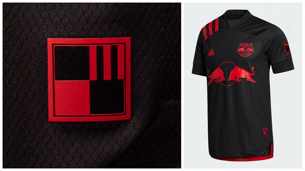
11.New York Red Bulls
What we like: The all-black kit with bright red accent work catches the eye expertly, and the MetroStars jock tag is a wonderful nod to the club's 25-year history.
What we don't: That there aren't more tributes to the old MetroStars identity.
The verdict: There aren't many kits this season that are sharper than this one, but more Metros love would've been a smash hit.
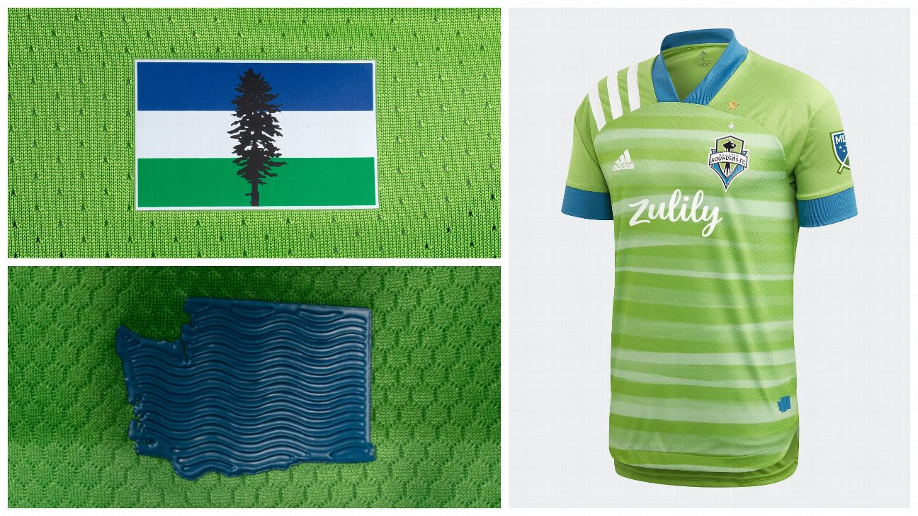
12.Seattle Sounders
What we like: The Cascadia flag on the back of the neck, the three-dimensional state of Washington jock tag and the endless waves paying homage to the Puget Sound.
What we don't: The placement of the gold star commemorating the Sounders' MLS Cup triumph.
The verdict: The loudest shirt to use this template, the way the Wave Green contrasts with the big Three Stripes and bold blue collar and cuffs takes some getting used to, but the little details outlined above are exquisite.
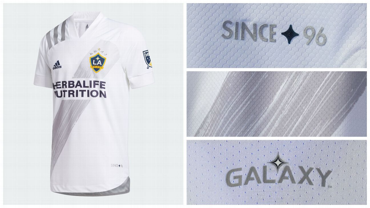
13.LA Galaxy
What we like: The "Since 96" branding works in the Galaxy's favor in their battle with upstart LAFC for the soul of Los Angeles, and it makes for a meaningful jock tag.
What we don't: Since when has silver been a prominent color for the five-time MLS Cup winners?
The verdict: It's actually a pretty sharp design, but it's impossible to escape the question of "Why silver?".
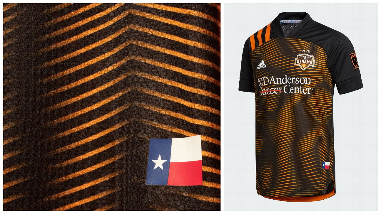
14. Houston Dynamo
What we like: The graphic pattern is said to be inspired by Houston's never-stop-moving personality, which is a challenging visual to pin down, but the graphic itself is appeasing.
What we don't: The pattern features so many lines of orange that the print never quite looks altogether black or orange, which makes its meeting with the all-black shoulders and bright orange stripes jarring.
The verdict: With some more restrained use of orange in the pattern, this could've been a real winner.
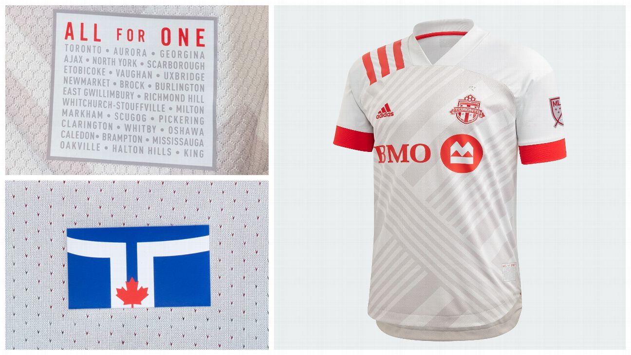
15.Toronto FC
What we like: Toronto has an incredible city flag, so its inclusion on the back of the neck is perfect. To add the cities that surround Toronto to the jock tag is a surefire way to earn some goodwill from those in The Six and beyond.
What we don't: The graphic pattern. It's reminiscent of the first generation of Adidas' Nemeziz, and it's hard to gather what its inspiration is.
The verdict: Some promising elements to this shirt with some charming connections to the city, but it's missing a theme.
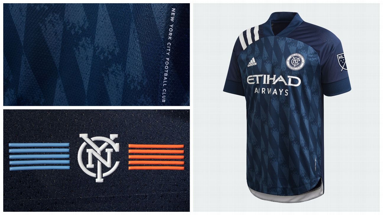
16.New York City FC
What we like: The raised New York City flag housing the "NYC" from the club's crest is a phenomenal touch for the back of the neck.
What we don't: The lozenge graphic is said to be inspired by the architecture of the Brooklyn Bridge, but it's really hard not to see the Bavarian flag and its constant reminders of Bayern Munich.
The verdict: The parallels to the Bavarian flag are too strong to ignore, even if the subtle details are impressive.
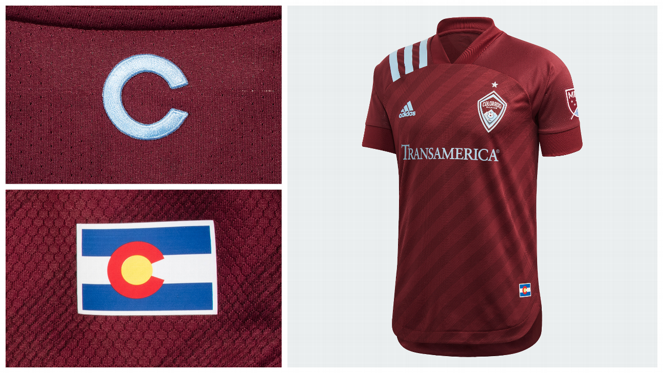
17.Colorado Rapids
What we like: This is a color palette that really works with this Adidas template, the sky blue stripes over the shoulder popping in perfect contrast to the shirt's burgundy.
What we don't: It's clean, it's sharp, but there's little in this shirt that will make you stand up and take notice.
The verdict: Presumably the embossed diagonal stripes recall feelings climbing, of altitude -- you know, like in the Rockies -- but it's challenging to discern much personality from this kit, even if the colors work spectacularly well with this template.
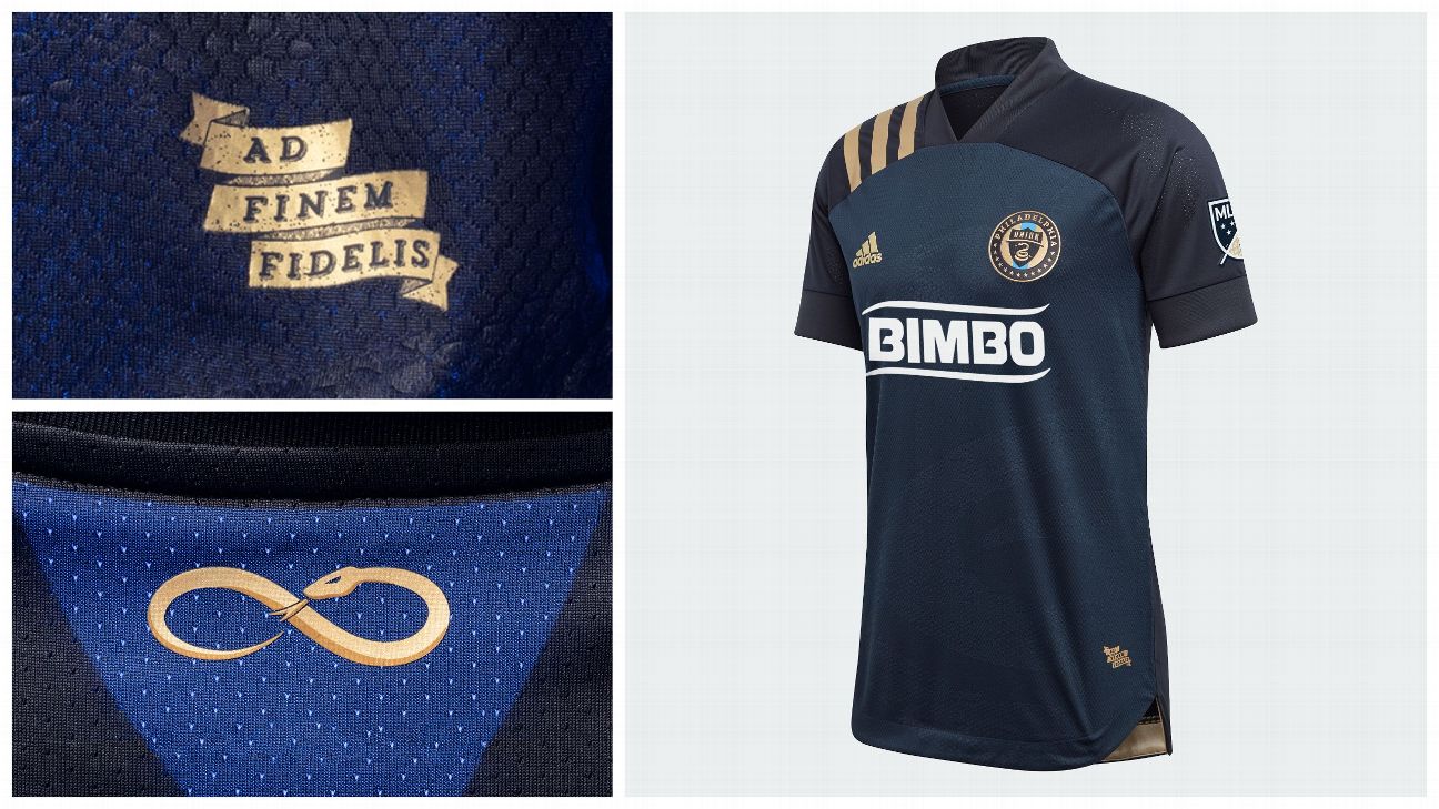
18.Philadelphia Union
What we like: The embossed snake gives the Union's shirt flair without making a stately color palette appear ostentatious.
What we don't: There really isn't anything to dislike about it, but at the same time, there's not a lot to it beyond the embossed snake -- which will be hard to see without standing three feet away or actively looking for it.
The verdict: It's clever, it's easy on the eye, but ultimately it's rather forgettable.
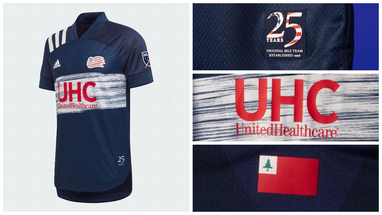
19.New England Revolution
What we like: The white band across the front of the shirt is a reimagining of the club's inaugural shirt, which is the sort of recognition of history each original MLS franchise should strive for.
What we don't: If you're going to reimagine the white band, why not remagine the sunburst-like pattern that also festooned that 1996 top?
The verdict: It's a throwback to the very beginning of MLS, with a modern interpretation. Solid, if unspectacular execution.
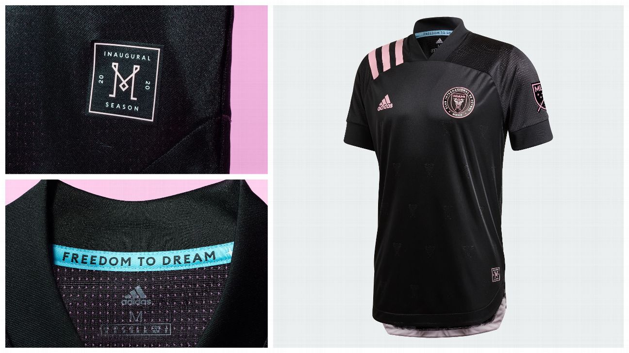
20.Inter Miami
What we like: The embossed herons all over the shirt are incredibly classy, taking the premier element of one of the best crests in the league and lending it to the rest of the shirt.
What we don't: It was probably unrealistic to expect Inter to adopt the Miami Heat's Vice jerseys, but this much black and this little pink is a disappointment.
The verdict: It's a classy execution, but for the city of Miami and the colors at the club's disposal, this shirt is too conservative.
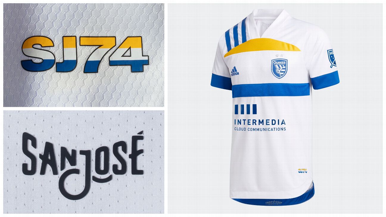
21.San Jose Earthquakes
What we like: All the nods to the city: the state flag being the inspiration for the front of the shirt, and the jock tag, and "San Jose" being printed on the back of the neck. This shirt screams "South Bay!"
What we don't: It's not the Quakes' fault, but the San Jose city flag looks like an old (and upside down) Visa logo. Before San Jose loses its collective cool, it's a great flag, but for a shirt that's meant to be plastered with sponsors, the similarities to a once-prominent logo is not ideal.
The verdict: This will probably be a smash hit in the South Bay, and thus is probably being grossly underrated, but you can't unsee that Visa logo.
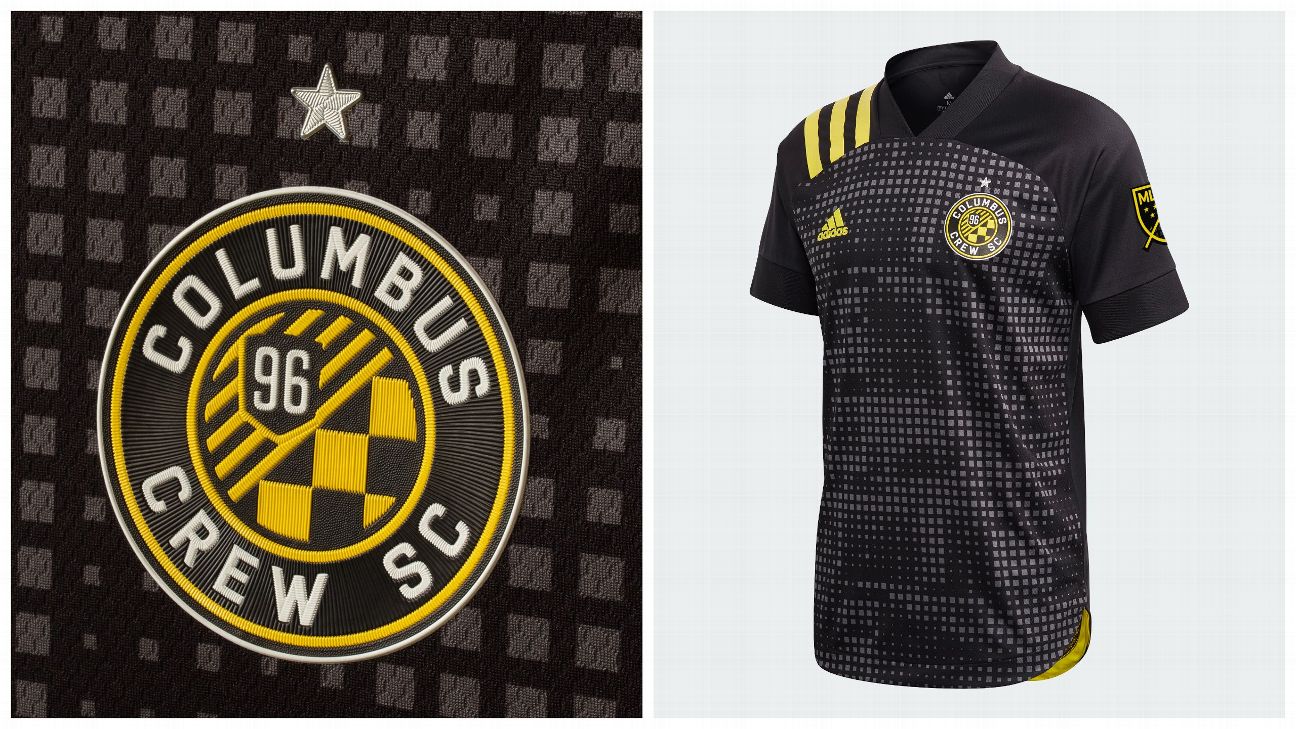
22. Columbus Crew
What we like: The bold gold shoulder stripes recall the early days of Crew, with big swathes of black and gold, evoking memories of the three men in hardhats.
What we don't: The Crew say the graphic pattern on the front of the shirt is checkerboard, which would make for nice a tie in to the club's crest, but the futuristic take on that pattern doesn't fit MLS' first club celebrating its 25th year of existence.
The verdict: If there was one club who deserved a proper throwback, it's the Crew. And this isn't it.
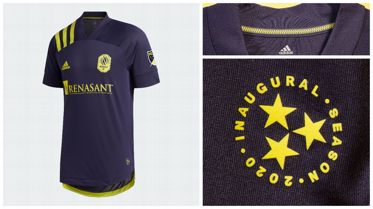
23. Nashville SC
What we like: The pop of the electric gold catches the eye exceedingly well when set against the acoustic blue shirt, and the neck tape featuring sound waves made up of a ceaseless string of N's is a nice touch.
What we don't: While several shirts have used embossing or raised three-dimensional elements to lend themselves texture, Nashville's is missing that, and comes across as a bit flat.
The verdict: There's potential in the colors, but this top is a little short on character.
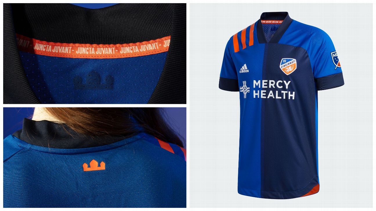
24.FC Cincinnati
What we like: The introduction of navy provides some added depth to what was already a pretty strong color combination.
What we don't: You have to look closely to see it, but the narrow stripe separating the two sides of this half-and-half shirt make it a challenge not to see Juventus' home top from this season.
The verdict: It's a step in the right direction for Cincinnati, if only a small one.
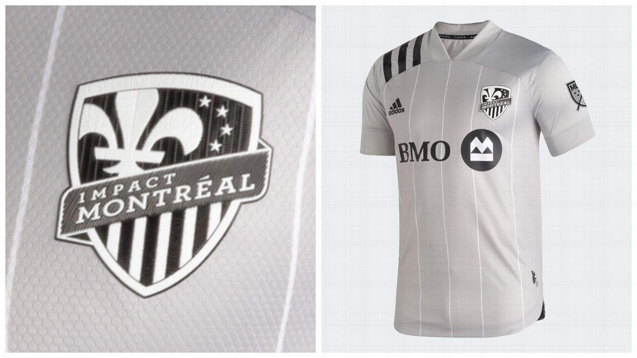
25.Montreal Impact
What we like: That the pinstripes are hand drawn.
What we don't: The distinct lack of color.
The verdict: If there were a story behind the color choices, the grayscale kit would be more tolerable, but there doesn't seem to be -- at least not that the club is telling.
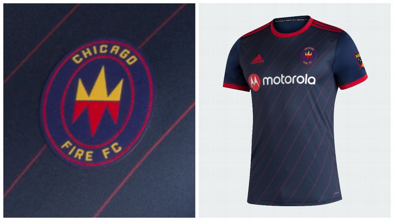
26.Chicago Fire
What we like: You can't go wrong with pinstripes, and this shirt definitely has them.
What we don't: The Fire's rebrand happened too late in the process for Adidas to create the club a bespoke kit from the template every other MLS club is using, which leaves this shirt looking somewhat incomplete.
The verdict: Let's consider this incomplete, and wait for the 2021 kits to truly judge Chicago.
Related Video
Related Topics
- SPORTS
- ESPN
- CHICAGO FIRE
- LAFC
- FC DALLAS
- VANCOUVER WHITECAPS
- ORLANDO CITY-SC
- PORTLAND TIMBERS
- HOUSTON DYNAMO
- TORONTO FC
- REAL SALT-LAKE
- PHILADELPHIA UNION
- MONTREAL IMPACT
- SPORTING KANSAS-CITY
- SEATTLE SOUNDERS-FC
- LA GALAXY
- NEW YORK-CITY-FC
- INTER MIAMI-CF
- NASHVILLE SC
- DC UNITED
- ATLANTA UNITED-FC
- NEW ENGLAND-REVOLUTION
- NEW YORK-RED-BULLS
- MINNESOTA UNITED-FC
- SAN JOSE-EARTHQUAKES
- FC CINCINNATI
- MAJOR LEAGUE-SOCCER
- COLORADO RAPIDS
- COLUMBUS CREW-SC


